
Setting up a great pre-launch landing page is one of the key tactics you can use to get your marketing off the ground. Marketing doesn’t just begin when you launch your fashion brand, it starts long before you ever get to your first sale. Pre-launch marketing is essential to building your community, your brand, and your marketing plan.
A “coming soon” landing page will give your potential customers something to engage with when they hear about you, and it will give you a way to get their email so you can start your pre-launch email marketing strategy. You can also use this page to start building your brand awareness, teasing your product, A/B testing your messaging or creative, and driving social follower growth.
Let’s look at a few great pre-launch landing pages to understand the common themes that make them successful!
1. Harry’s
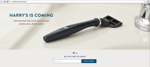
Harry’s, the shaving startup, created a pre-launch landing page that successfully gathered 100,000 emails in a single week. What was the key to its success? A great solution to a problem, for one, but also a well-designed referral program on their landing page that really drove word-of-mouth.
Taking a quick look at their pre-launch landing page, it’s easy to see exactly what the brand stands for and what the product is, even though the copy doesn’t say the word “razor” or “shaving.” The copy is clever and humorous, without being confusing or overly jargon-y.
There’s a clear call-to-action that is above the fold, and no confusion about what they want you to do. This is a great example of a landing page that is aligned with the brand voice and value proposition that the company wants to convey.
2. Everlane
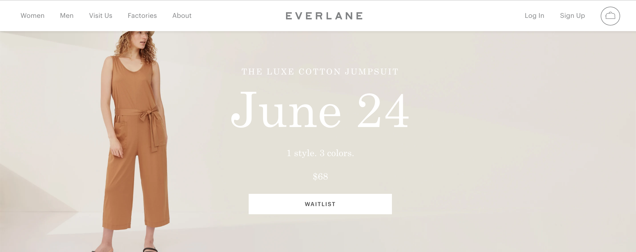
While Everlane has already launched and established their brand, they continue to create pre-launch pages that build excitement for new product lines coming soon. It’s not only a great way to create buzz around new designs launching, but it’s also a way for Everlane to gauge interest for these products.
This landing page is similarly clean and simple, showcasing the product itself and a few brief descriptive lines. Pre-launch landing pages should be very clear about what you’re planning to sell, especially since a customer can’t get to a product page to get more details yet.
The launch date in large text highlights the most important information for the customer, and the “Waitlist” call-to-action is front and center. This is a great example of a landing page giving the customer all the important information they need to know, without cluttering it up with details.
3. Robinhood
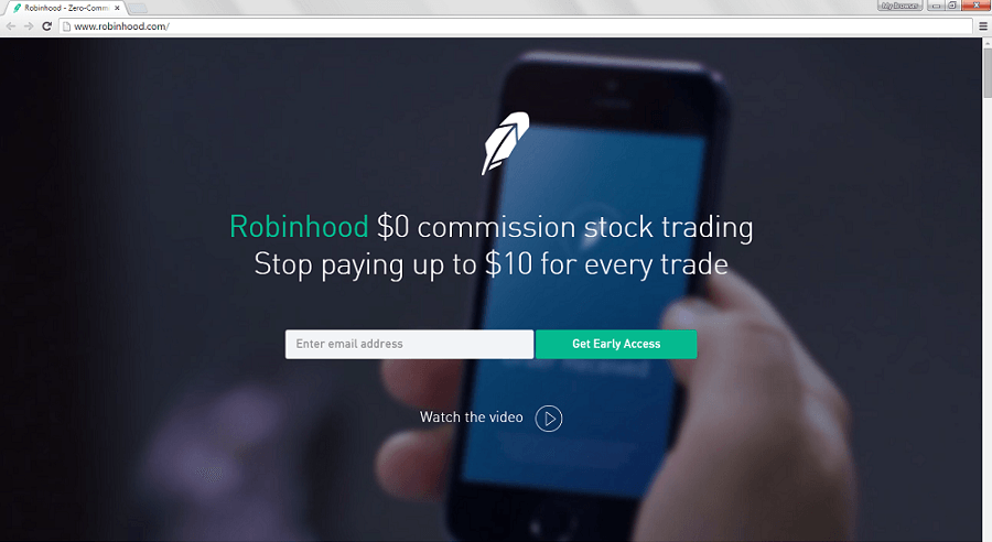
While Robinhood is not a fashion or e-commerce brand (it’s an investment app), they still did a great job with building pre-launch buzz from their landing page that we can learn from. The copy is short, sweet, and crystal clear. It calls out a problem with investing and articulates the solution that Robinhood’s service provides to the user, all in two lines of text!
The call-to-action to “get early access” has added value and a sense of urgency, particularly for early adopters. In addition, Robinhood created a launch video to explain exactly what they do, and it’s linked clearly here. It’s so well-done, funny, and worth a watch if you haven’t seen it!
4. The 5th
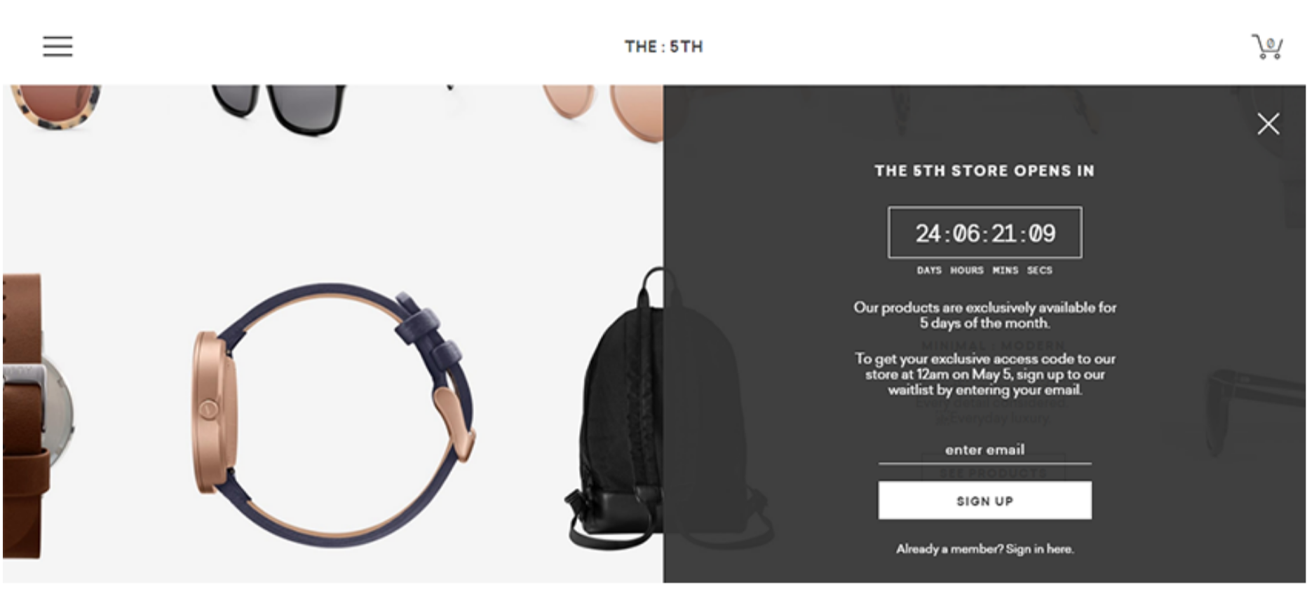
The 5th, an online accessories store for men and women, uses pre-launch landing pages for specific product drops. They do a fantastic job with highlighting the urgency with a countdown clock, and they explain the waitlist and shopping process with clear and straightforward copy.
5. Token
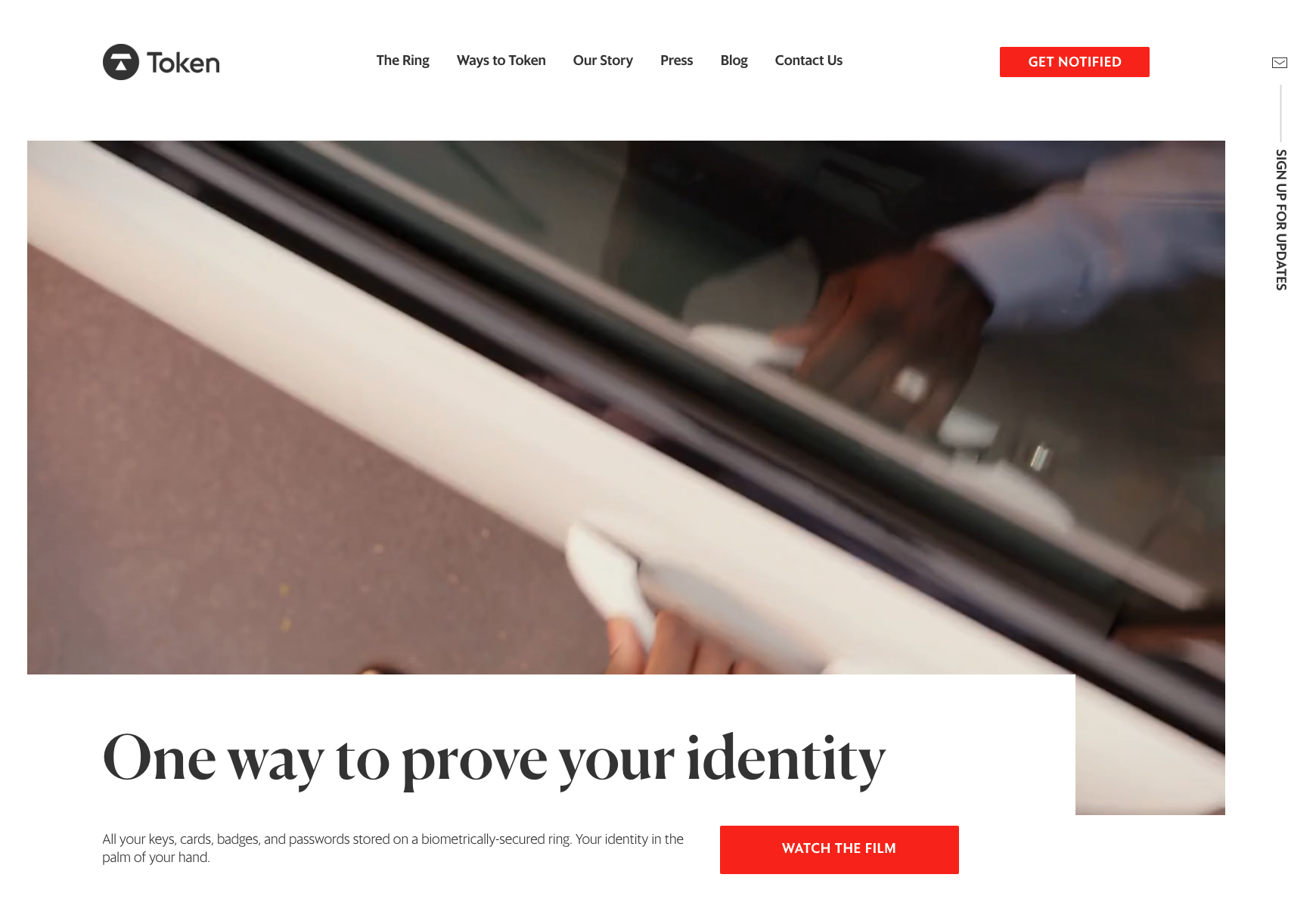
The Token ring hasn’t launched yet, but it already has a video showing off all its functions, a list of partnerships, and a lineup of different use cases on its landing page.
While this is a richer and lengthier landing page than you typically see pre-launch, Token does a great job of clearly explaining (and showing) a more complex product here.
It’s clear that they understand it will take the customer a few additional steps to fully take in the product features and value propositions, so they start with a call-to-action to watch the video. As you scroll further, you’re drawn in and educated on all the different features of the product, and then you finally reach the “Get Notified” call-to-action at the end when you’re ready.
What Makes a Great Pre-Launch Landing Page
Now that we’ve reviewed a couple of great pre-launch landing pages, it’s easy to see the common features that make them successful.
- Keep it simple. Feature a large, high-quality image and only a few lines of text. Think about the top questions that you would ask when you hear about a new fashion startup launching (when, what, why). Answer those and only those questions.
- Stay on brand. While it’s important to be clear, you also want this landing page to accurately reflect your brand to people who will be your future customers. As a new brand, you have to ensure your brand voice and style is present on your landing page.
- Articulate the values. Features are great, but focusing on the values that your brand and your designs have, will be more likely to draw in your customers.
- Have a clear call-to-action. Choose one key action and make it absolutely clear what you want your customer to do. Whether it’s signing up for your email list, following your Instagram, or watching a video, you can emphasize calls-to-action with great copy, colorful buttons, and great design.
———-
What’s your favorite “coming soon” or “waitlist” landing page that you’ve seen? We’d love to know other great examples to learn from.

Jay
Great article! Thank you very much for writing it.
I was wondering how long before launch date is appropriate to have a live landing page? I’m still at least a year away from being ready to launch and I wonder if it’s a great way to gather emails or if potential customers will just forget about the brand by the time the website goes live?
Many thanks,
Jen
Nicole Giordano
Hi Jen,
As long as you communicate on a regular basis with the list you are building through the landing page, they won’t forget about you. My advice is to get the landing page with email capture up now and have a plan for monthly communication via email to keep the audience involved and excited. 🙂
Tish
Great read and very helpful!
How would you suggest to create a landing page for an upcoming women’s apparel & accessory boutique? It doesn’t feature just one brand so I’m wondering how to narrow down the what and why. Any advice would help. Thanks
Casey Cline
I think I would make sure you’ve really nailed down the boutique’s mission, brand voice, and unique value proposition FIRST. Once you have those things clearly articulated it will be much easier to pick the most important or compelling details to include on the landing page.I’d also probably do some research into what competitors have done. Good luck!