The Retail Report is a recurring look at different physical retail shops. Here, we examine the merchandising, branding, marketing, and storytelling through branded environments.
Holiday Windows in NYC
If you haven’t already – make a trip to see NYC’s most beautiful holiday window displays. Viewing the windows is not only entertaining and inspiring, but what you see may inform your own startup fashion and visual merchandising efforts. If you can’t make it, view google’s virtual tour.
Not just for the holidays, windows are an important part of merchandising retail strategy. A well-designed window can capitalize on foot traffic and boost sales. Iconic brands and retailers in NYC have perfected the art of the window dressing and use this tactic effectively to drive purchases, generate PR and brand-awareness. This is especially true during the holiday (i.e. shopping) season.
A short-list of the best displays and corresponding themes include:
- Barneys: Love, Peace and Joy
- Lord & Taylor: Enchanted Forest
- Henri Bendel: From Bendel with Love
- Macy’s: Believing the Magic
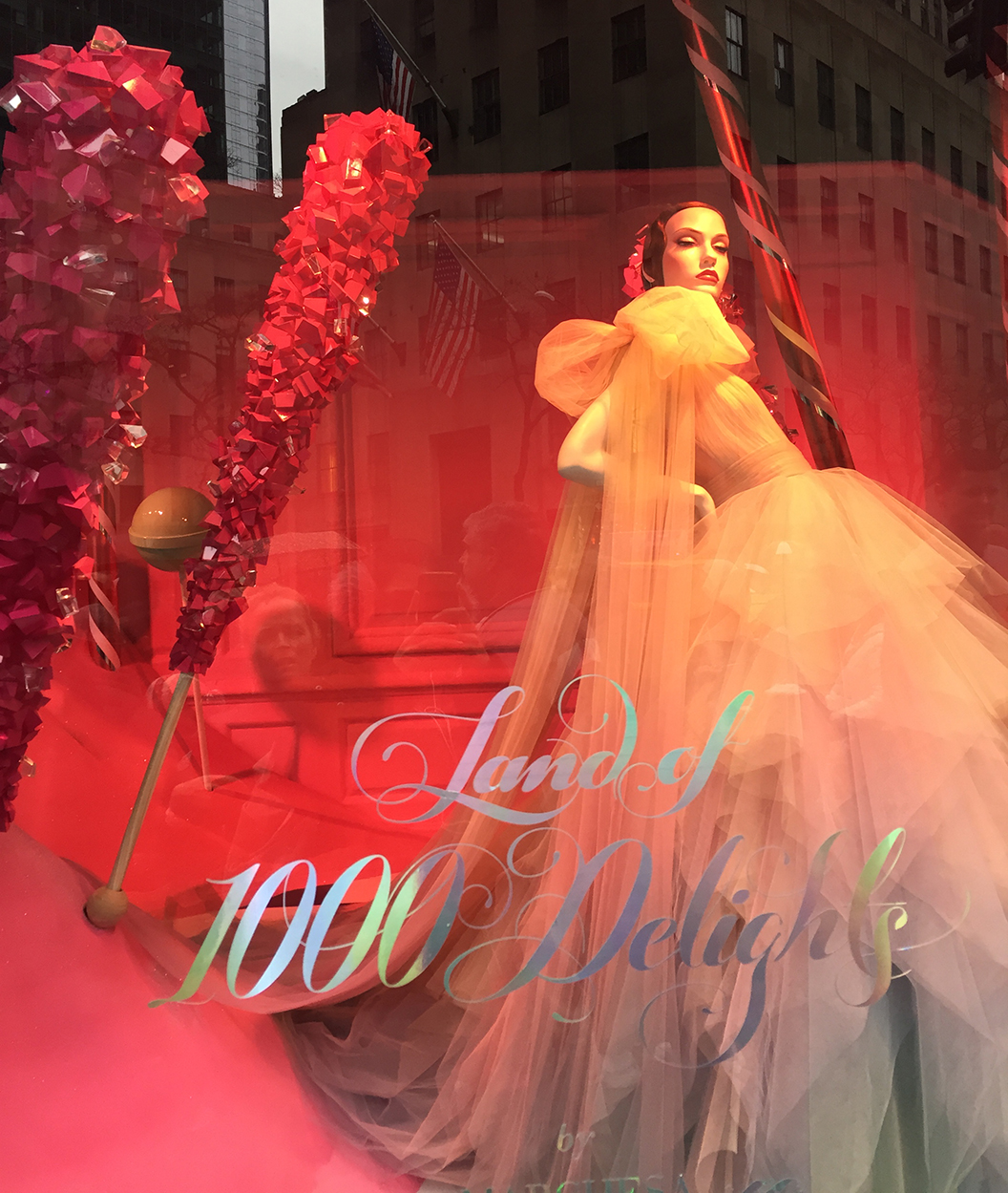
- Saks Fifth Avenue: Land of 1,000 Delights
- Tiffany’s: Tiffany New York Christmas
- Bloomingdale’s: Light Up a Young Mind
- Bergdorf Goodman: Destination Extraordinary
What To Look For
Obviously these brands have budgets startup fashion companies only dream of (for the time being at least). But, as mentioned above, observing certain details can influence your own display choices, whether you have a retail space, pop up shop, or a stall at a market.
When relying on foot traffic, your goal is to capture a potential customer’s attention, draw the person in for a closer look, and seal the deal. You do this by having an eye-catching display. The first step in creating one, is to decide on a story or theme you want to tell, or what lifestyle you want to convey.
Tip: In the planning stage, you may make a moodboard to help gather thoughts.
Even if you have a small stall at a market – all this still applies! You can use props, hang background images, or even stack your packaging to create something fun. The elements of a strong, compelling display are listed below. Big retailers use most, if not all these elements at once. If you don’t have that kind of budget, choose one or two and try to incorporate those as best you can. Examples of how these elements are used are further below.
- Story -Telling and Themes
- Seasonality
- Props
- Color
- Scale
- Height
- Variety
- Choice in Materials
- Layers
- Details
- Lighting
- Delight
Iconic Retail Holiday Windows – Storytelling at its Best
Bergdorf Goodman
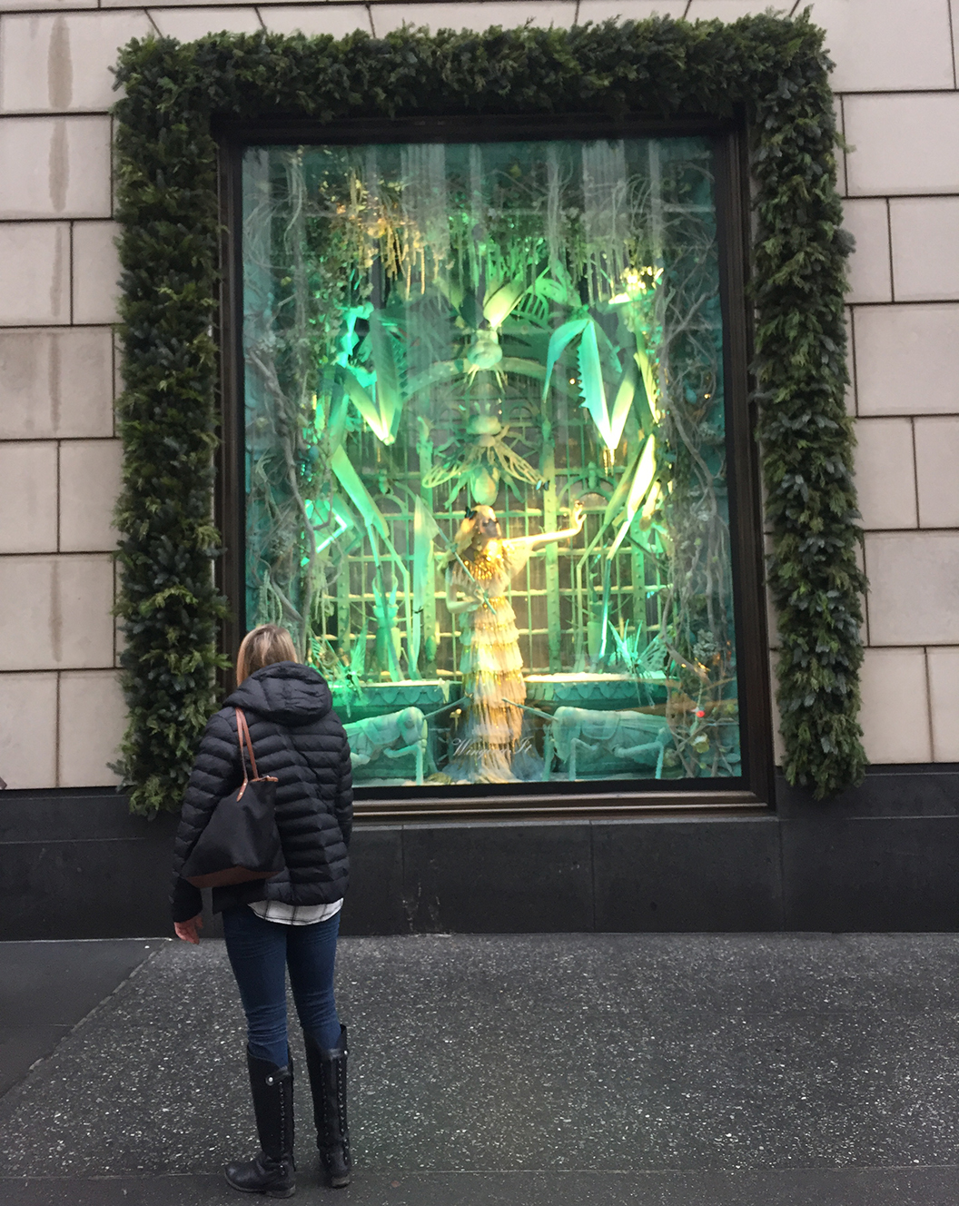
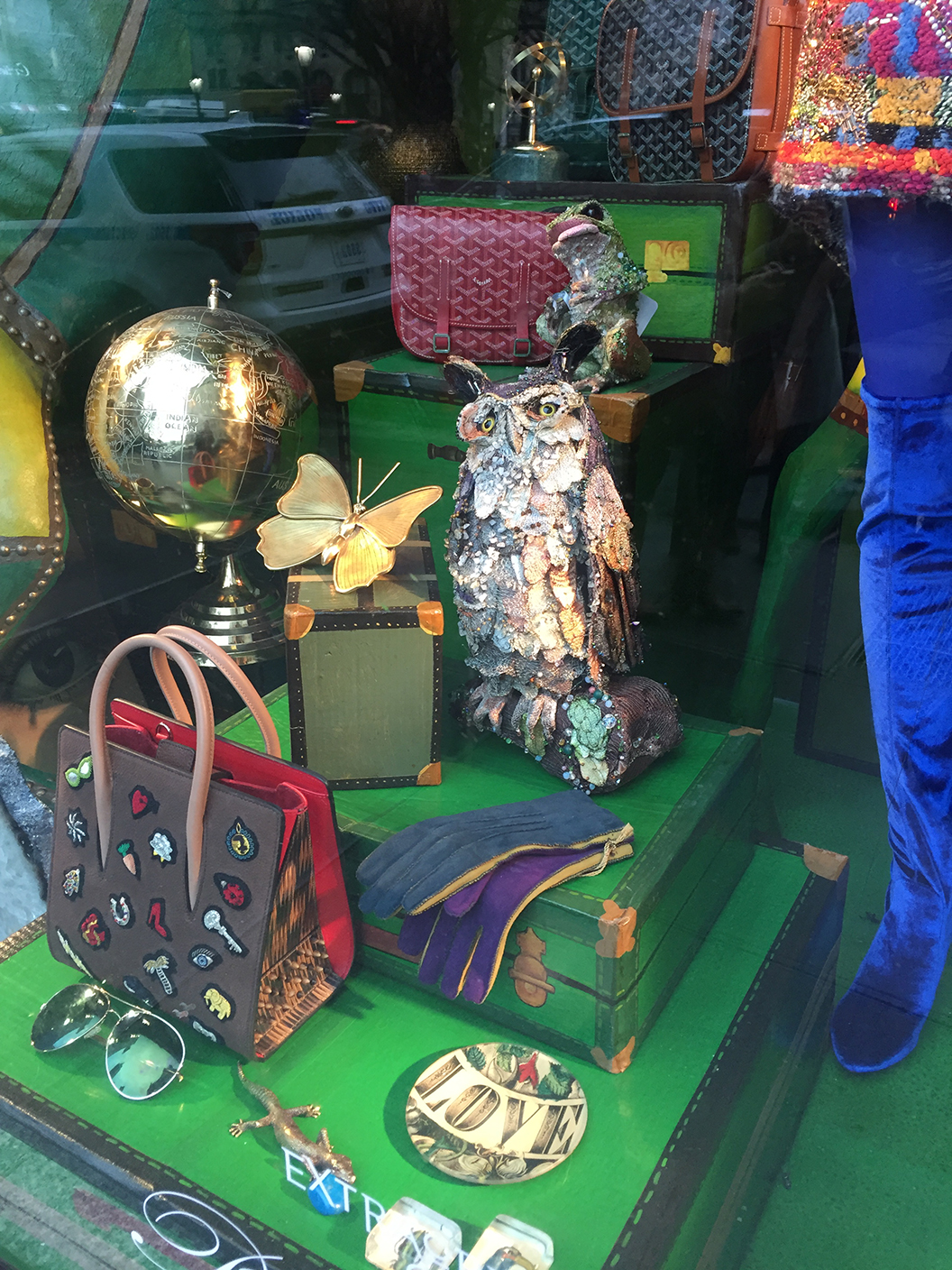
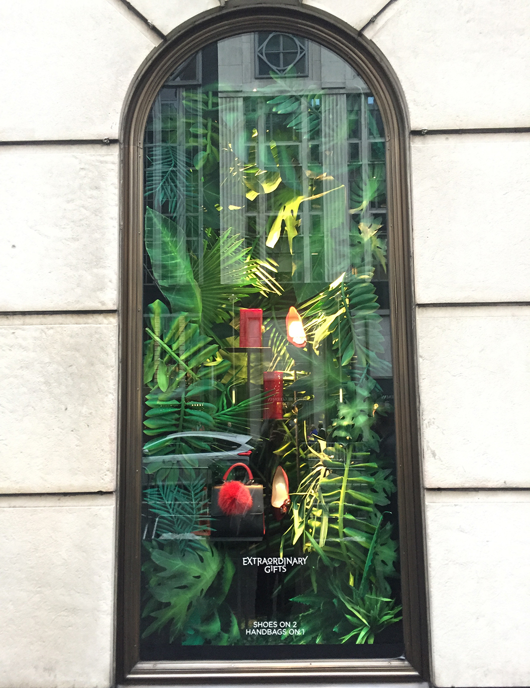
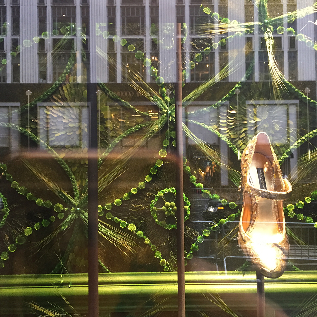
This year’s Bergdorf Goodman theme is “Destination Extraordinary.” They created displays of “lush locales, unexpected landscapes and verdant gardens.” They did a very thorough job of fulfilling this vision. Bergdorf hit every single element listed above – and then more. What struck me in particular was the extreme levels of detail and use of layering (to create depth and discovery), care in construction, choice of luscious materials, and the amazing balance between creating a beautiful scene, and pushing merchandise. The scenes were extravagant and inspirational. Everything conveyed the very idea of luxury, which is of course, what Bergdorf Goodman is known for. These windows had the power to stop people in their tracks:
Saks Fifth Avenue
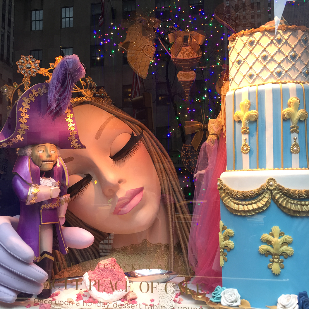
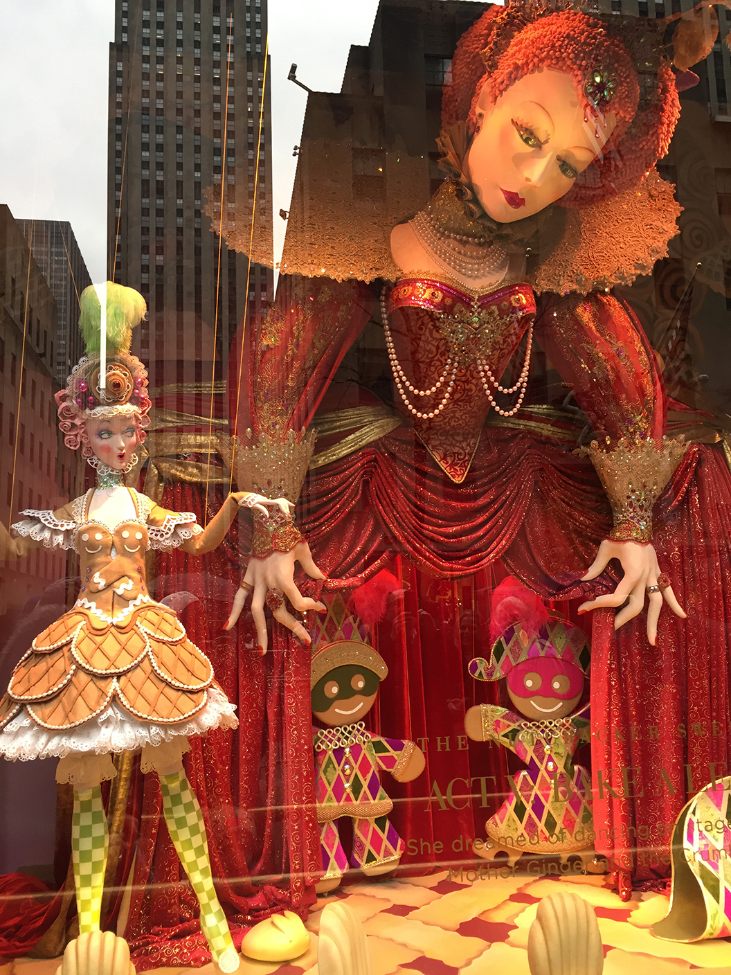
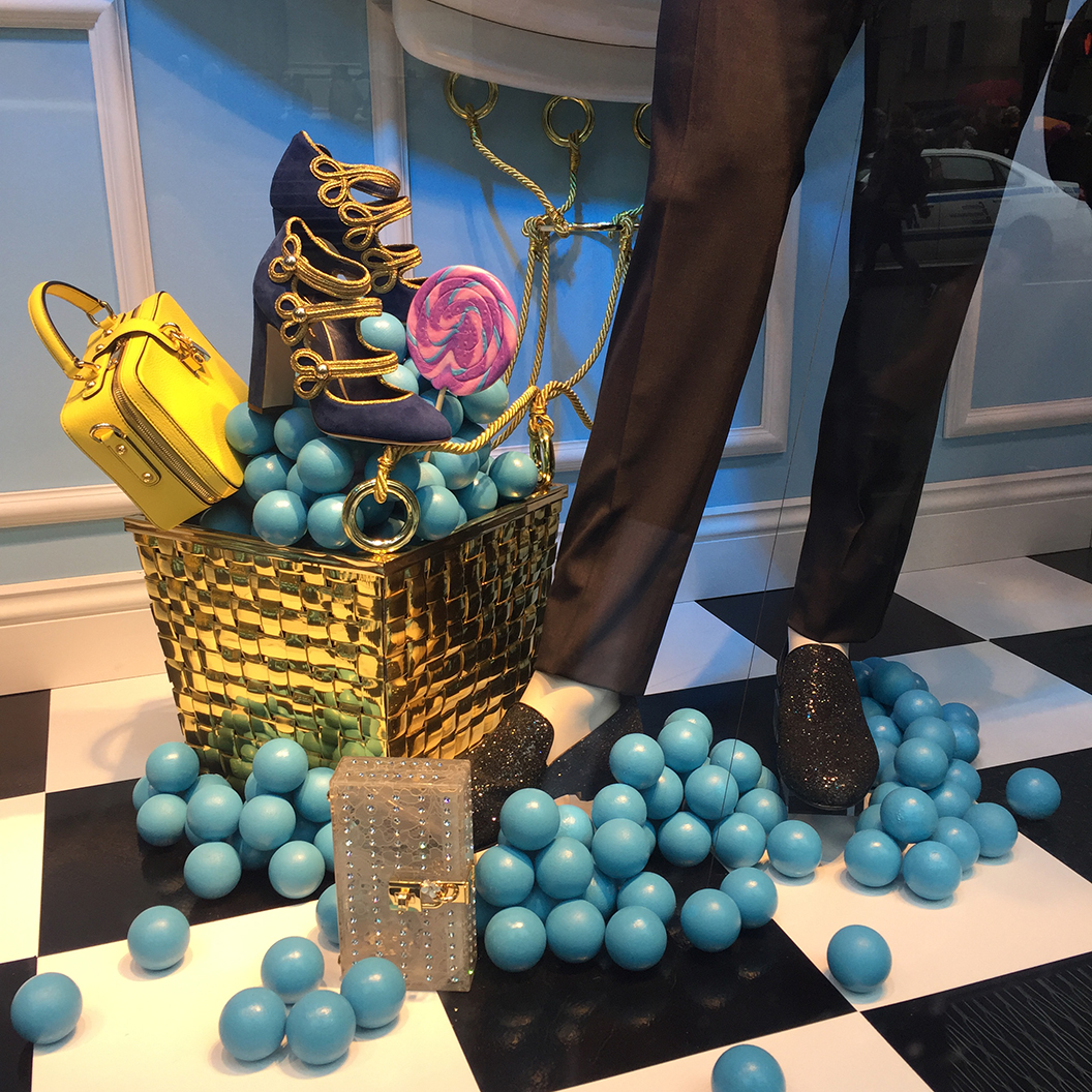
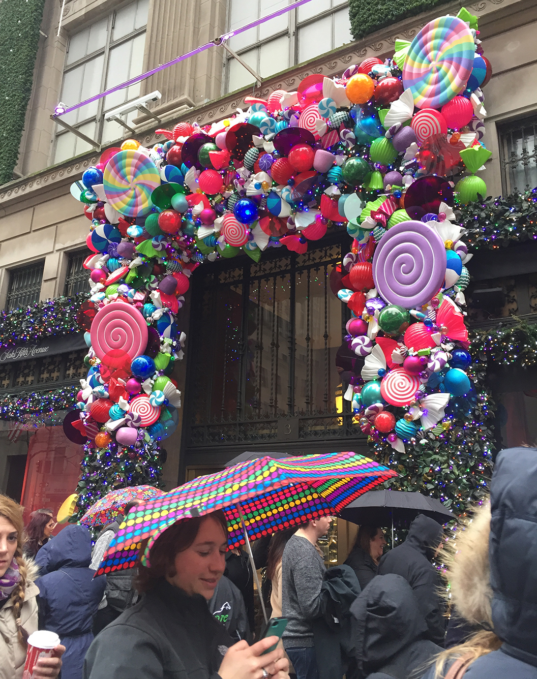
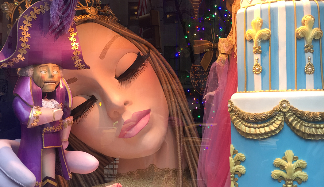
Saks Fifth Avenue’s “Land of 1,000 Delights” windows feature a sub-theme– “The Nutcracker Sweet” where characters from the nutcracker fulfill the storyline among a landscape of sweet treats. The windows also combine candy with one-of-a-kind fashion pieces from designers, called “Candy Couture.”
There is a *line around the block* to see these windows. It’s not a surprise given the richness of the scenes and the unexpected magic of movement in the mechanical performances.
Bloomingdale’s
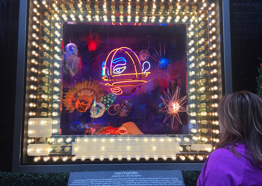
Bloomingdale’s took a philanthropic approach with its “Light Up a Young Mind” series, part of its holiday “Light” campaign. The store exclusively commissioned visual artists to create eight, one-of-a-kind chandeliers to be auctioned off to benefit the Child Mind Institute. This created a very different show, which differentiated the brand from others. Stunning and engaging, these windows fulfilled the purpose of making people stop and learn more.
Elements of Good Displays
Props & Variety
Props help tell the story and fill space in an interesting way. They complete a scene, make it attention-worthy and create delight in viewers. How can you not want to stop and look at windowscapes like these from Bergdorf’s and Saks?
Color & Layers
You can see how Bergdorf’s window below played with color and contrast to create visual interest. Red merchandise pops out against the green background, creating both a beautiful display, and a focused showcase for merchandise. Whatever your set-up- store, stall, or event booth – playful use of color is a great way to get attention and it doesn’t have to be elaborate. For example, you could do something as simple as taking your brand colors and reinforcing them over and over by using your packaging as a display (pay attention to height and scale with this!), and making sure display materials match, then adding a few props in the same colors.
Details
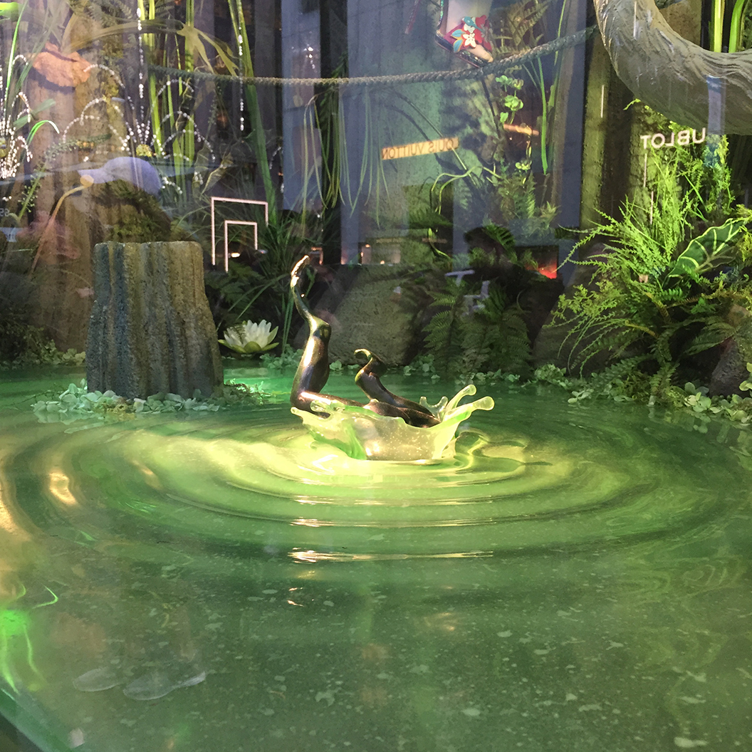
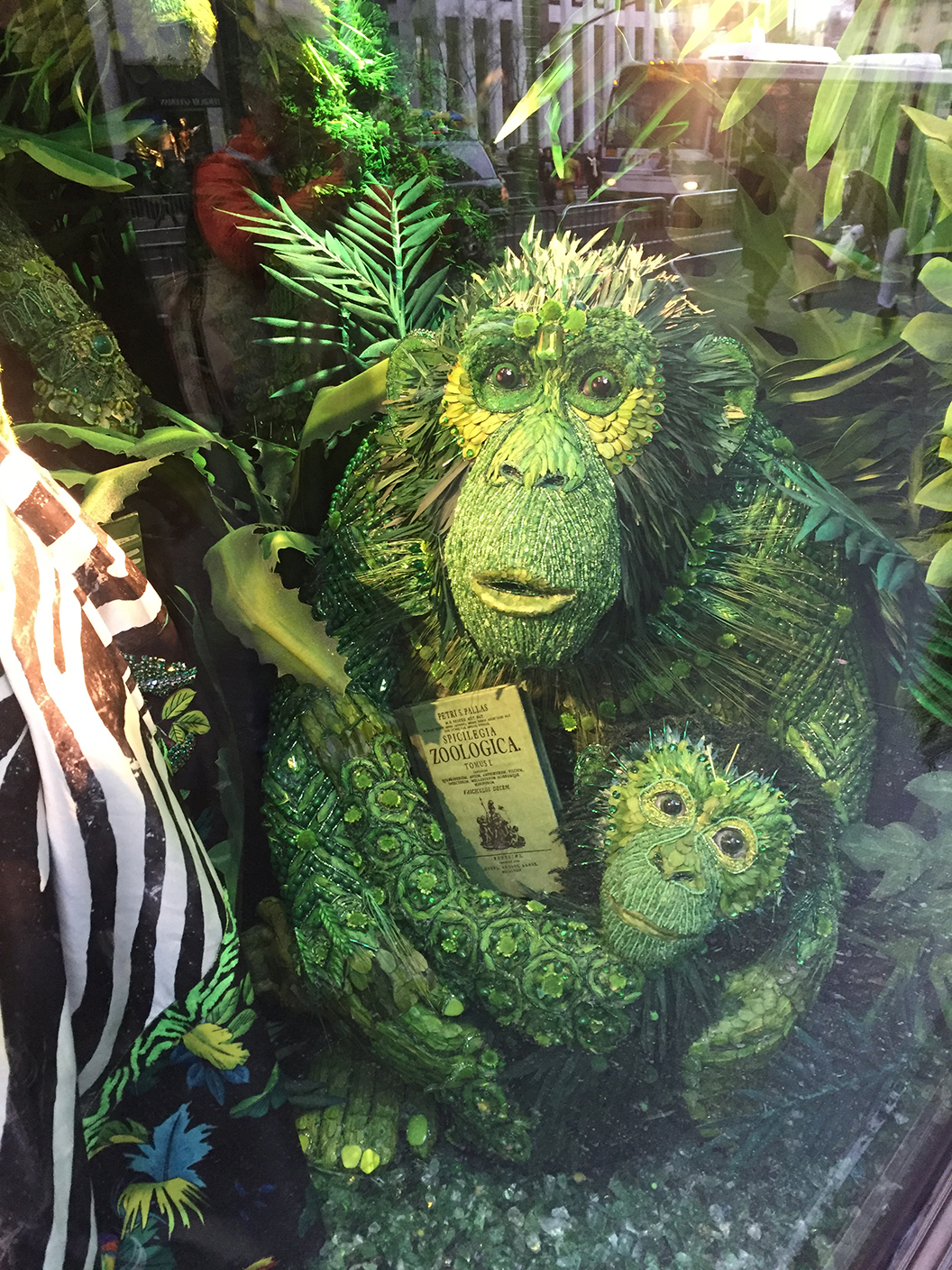
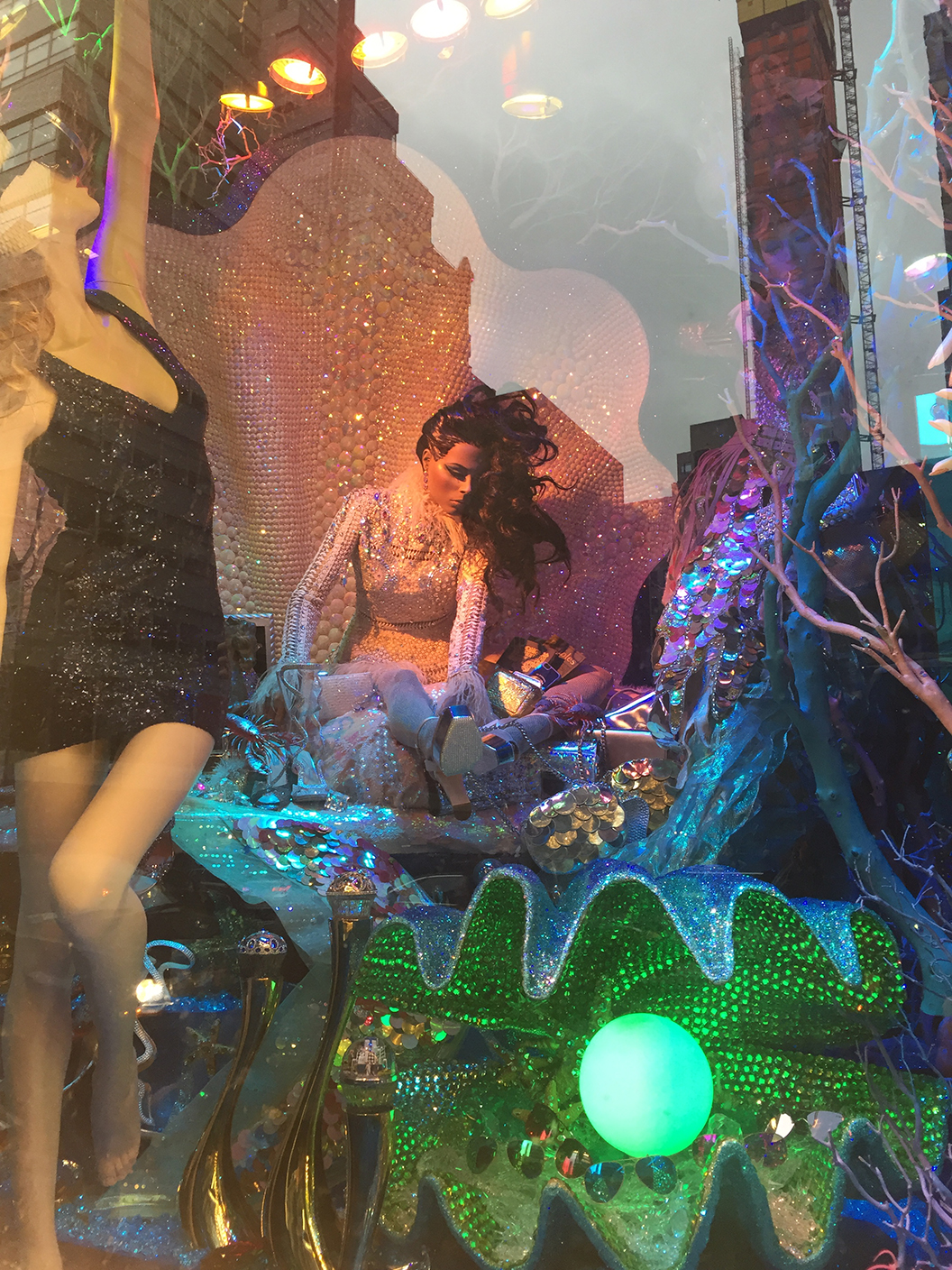
These aren’t the best pictures – but below you can see the extreme detail in the holiday displays. Bloomingdale’s mannequin with a model ship entwined in her hair, Bergdorf’s intricate handmade backdrop, prop frog jumping into rippling water, and bejewelled animals – these are just a small fraction of the details one could discover in the elaborate windows. These unexpected touches are what cause delight in customers and positive associations with a brand.
Lighting & Scale
All the retailers mentioned so far make disciplined use of lighting to create a mood or scene and to focus attention on certain areas, such as merchandise. Below is an example of how lighting created a very dramatic scene in the Bloomingdale’s windows, and the picture in the “Color & Layers” section (above) shows concentrated lighting on merchandise.
What Not To Do
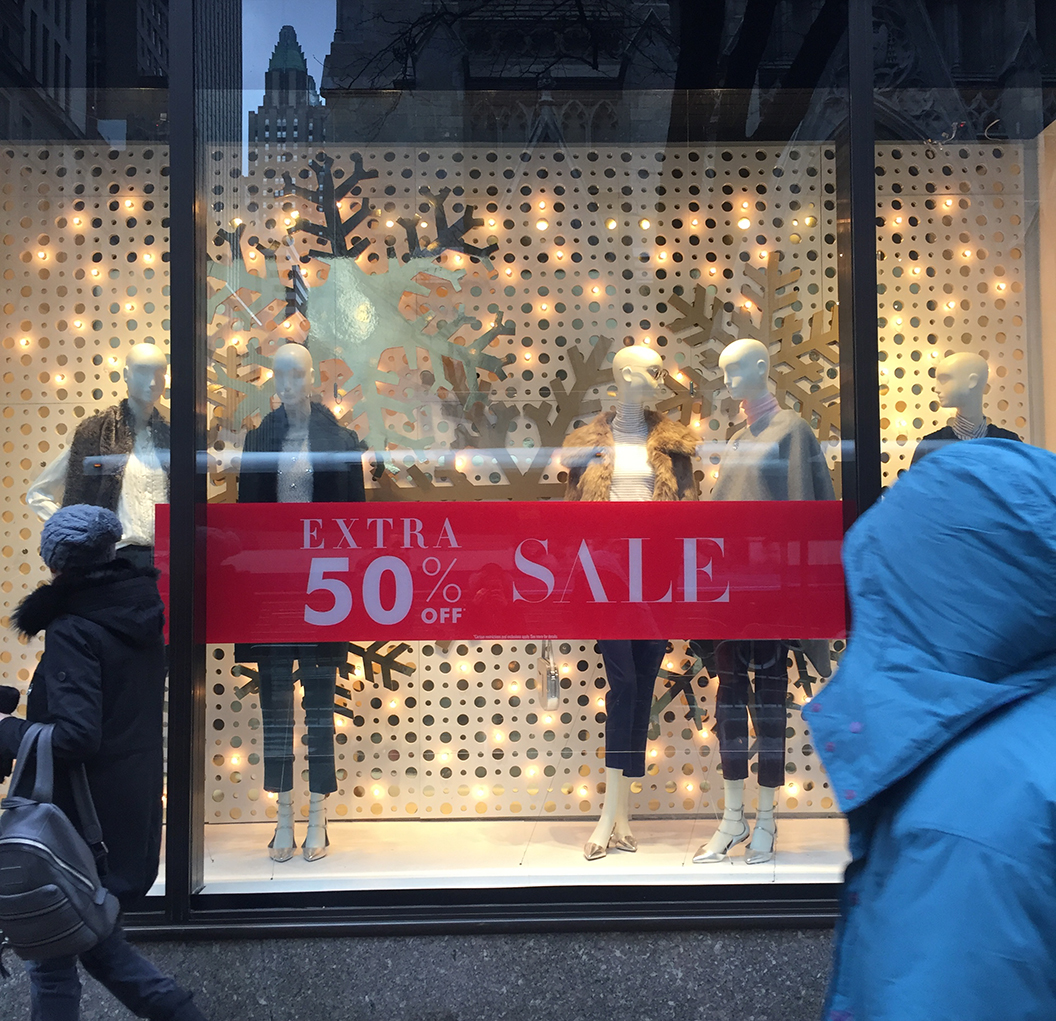
Interspersed between the iconic, luxury retailers mentioned above were the mainstream, reliable retailers such as Banana Republic, Gap, and Uniqlo. In stark contrast to their neighbors, they did the bare minimum to evoke the Christmas spirit. Personally, I think they could have tried a little harder, capitalizing on the fact that many people who look at the windows at luxury stores do not purchase from them.
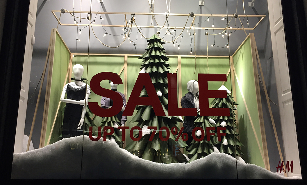
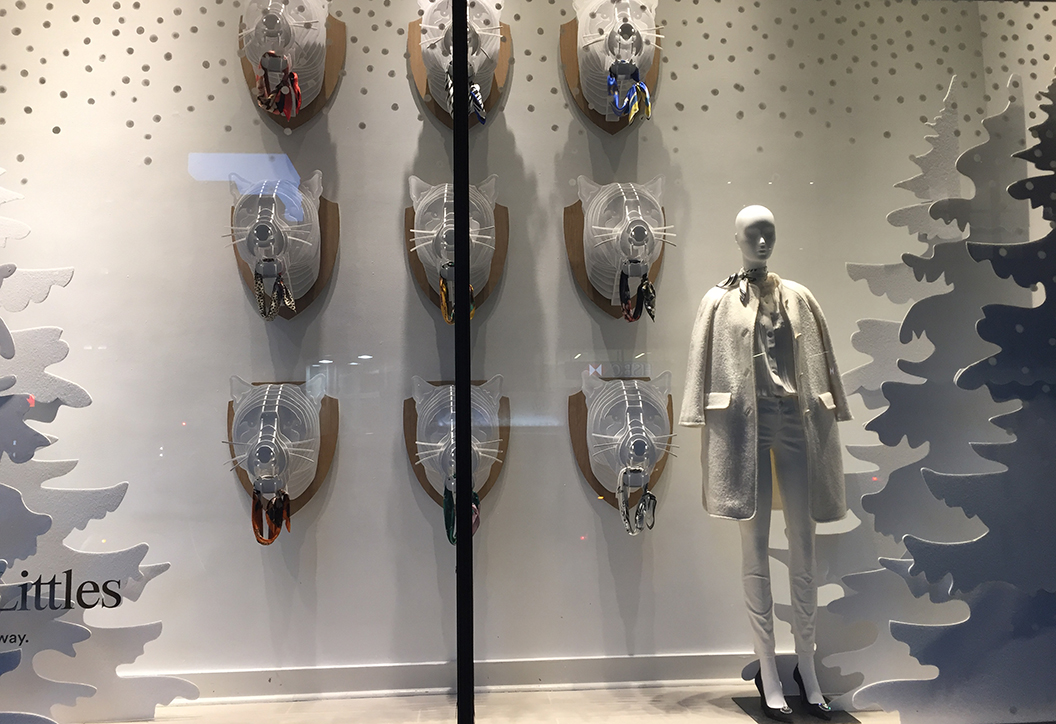
Of course they don’t have the budgets of luxury retailers, but as mentioned, you can do a lot if you choose just a few elements and add them together. For example, Banana Republic could have added stacks of boxes with bows to further enforce the “holiday” element and add additional layers for interest. Or they could have been more creative in their approach with discounts – instead of 50% off, maybe tried something like “this look for less” playing off their luxury neighbors. H&M and Ann Taylor did a better job with materials that don’t appear to be too expensive.
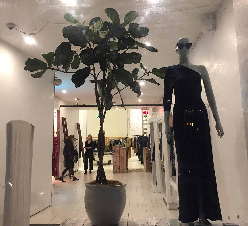
Another bad example we see here at Reformation. How dull is this? This does not inspire any sort of shopping impulse. As an eco-friendly brand, perhaps they didn’t want to use a bunch of materials but even here, there would have been room to play around with sustainable options such as potted Christmas trees, or biodegradable paper. Mentioning the use of these materials could have even reinforced brand values.
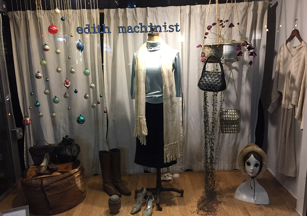
The Edith Machinist boutique below was simple, but it spoke to a certain lifestyle and incorporated the holidays by hanging a few simple ornaments. Steven Alan (not pictured) had a simple display as well, with bright and shiny paper decoration poofs. Another retailer filled the window’s ground with mirrored disco balls of different sizes. Simple, but effective gestures.
Conclusion
One criticism for Saks, Bergdorfs, and Bloomingdales is that there was a lack of diversity built into the windows. Year after year it seems to be the same kind of mannequins, dolls, and other characters. However, overall, these windows were nothing short of amazing.
The takeaway for smaller brands is to use these as sources of inspiration: create something on-brand, and try to think of surfaces and windows as multi-dimensional. Use layers to create visual interest, and color to draw the eye in. One more thing to think about. If you don’t have the budget to decorate across an environment, choose one area to have a big impact – such as the entryway. It doesn’t have to be as elaborate as those below, but hanging a few garlands or ornaments will look festive and inviting.


